Someone first encounters a development on a site sign. Later, they visit its website and receive a brochure from the sales team. The name, imagery and design connect those encounters. Separate pieces of information become a project they can recognize and understand.
Project branding provides that foundation. It establishes what makes a development distinctive, who it should appeal to and how those qualities can be expressed through language and design. The logo, colors and typefaces are tangible results of this work. Their direction comes from the development itself.
Start with the location, architecture and offer
The opening questions shape what follows. What kinds of apartments are being built? Which living situations do they suit? What does the location offer? How does the development differ from nearby alternatives?
A project with large family apartments and private gardens has different priorities from a building of compact city homes. Even within one audience, specific details matter: a useful entrance area, the connection to a terrace or convenient everyday routes.
Gather and assess these qualities first. Plans, specifications, location information and conversations with the project team provide a foundation. Looking at comparable offers helps distinguish familiar market language from qualities that belong particularly to this development.
At Oblik3D, research and analysis of the market, audience and competition can form part of the project branding scope. We establish the appropriate depth from the development and the information already available.
Define a clear direction
The analysis should lead to a short, understandable direction. It describes who the project is relevant to, which qualities deserve emphasis and how the development should be understood among the alternatives.
That direction should help with practical decisions. If a shared courtyard is central to the development, it can influence image selection, copy and perhaps the name. If distinctive materials and clear geometry define the architecture, they can inform the colors and typography.
Check each central message against the actual offer. Can the quality be found in the plans, location or specifications? This gives the copy and visualizations a reliable point of reference.
Decide what the project name needs to do
Some developments already have a suitable name. Others are known by their address. Some need a new name that brings together the place, architecture or idea of living there.
Consider its practical job. Does it need to be easy to communicate on the phone? Should it emphasize an address? Will people unfamiliar with the neighborhood understand it? These questions belong before the visual treatment of the name.
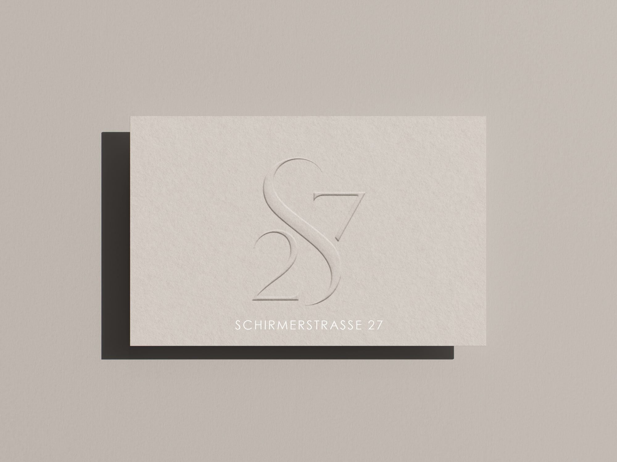
An address can provide a strong foundation. The S27 mark for Schirmerstraße 27 shows how letters and a street number can form a distinctive graphic device while keeping the address as their reference.
An existing name does not automatically need to change when a website or brochure is commissioned. The useful task may be to give it a clearer visual expression.
Develop the logo, colors and typography together
The visual identity translates the project’s direction into design. It includes the logo, color palette, typography and rules for using them.
Assess these elements together. A wordmark takes on a different character with a particular typeface and color. The identity becomes easier to judge when several applications are placed side by side.
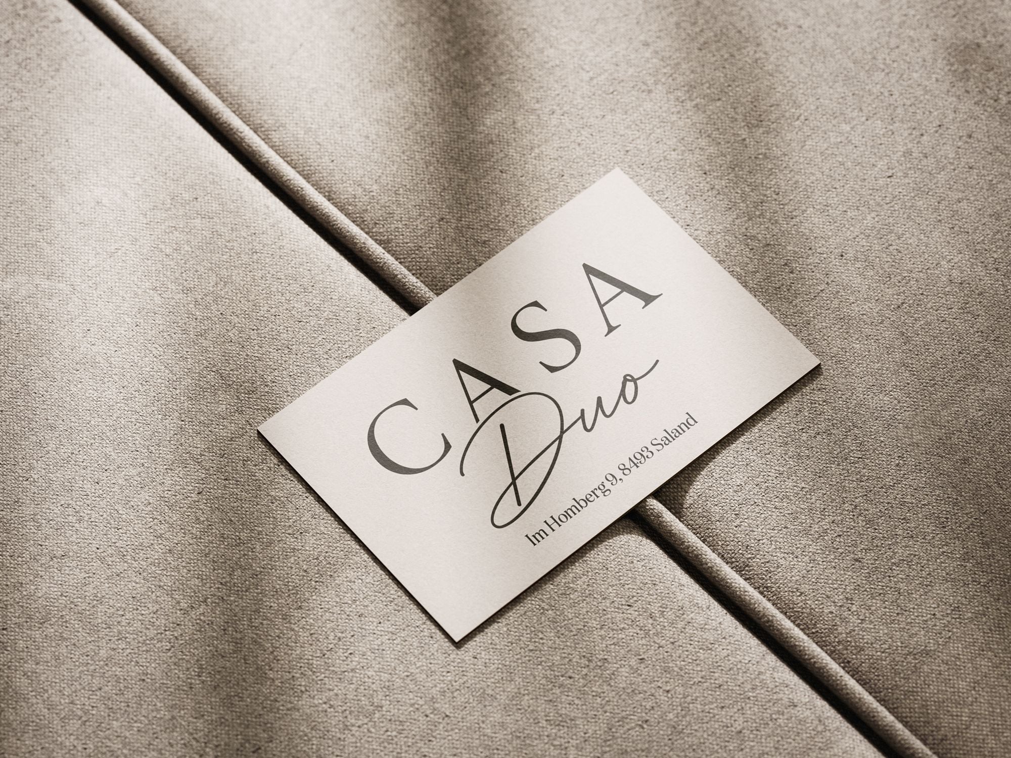
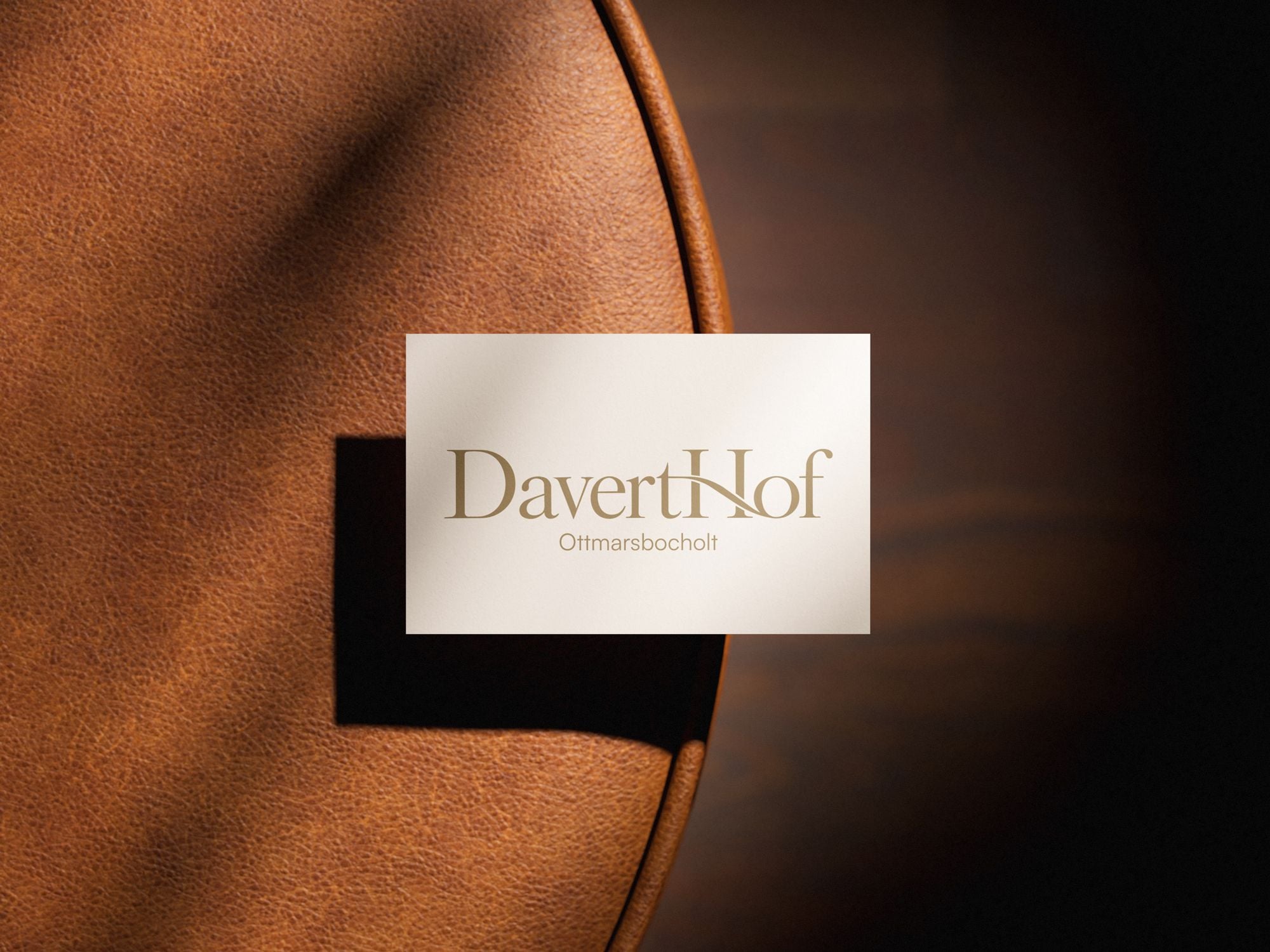
The work shows different approaches. CasaDuo pairs a restrained name with a flowing script. Schirmerstraße 27 uses S27 as a compact mark. Davert Hof combines its wordmark with a location line. Each can be assessed for the clarity of the name and its potential across further applications.
The card mockups are design presentations. They show the relationship between logo, typography and material. A full assessment of the identity also needs the other applications buyers will encounter.
Align the imagery with the architecture
Visualizations make up a large part of what buyers see. Their direction should therefore align with the project identity. Which viewpoints matter? Which rooms should be shown? What time of day and atmosphere help explain the building’s qualities?
At Zenznhof, timber façades, the deep pitched roof and private outdoor spaces contribute to the development’s character. These features give image planning a concrete starting point. A garden view tells a different part of the story from a street perspective; both can have a useful role.
The presentation should stay consistent with the planned architecture. Color and atmosphere can emphasize character. The essential features of the building and homes remain the common reference for the identity, images and sales materials.
Test the identity on real sales applications
Test the design early on the materials the project will need: website, brochure, sales floor plans and, where relevant, site signage or hoarding.
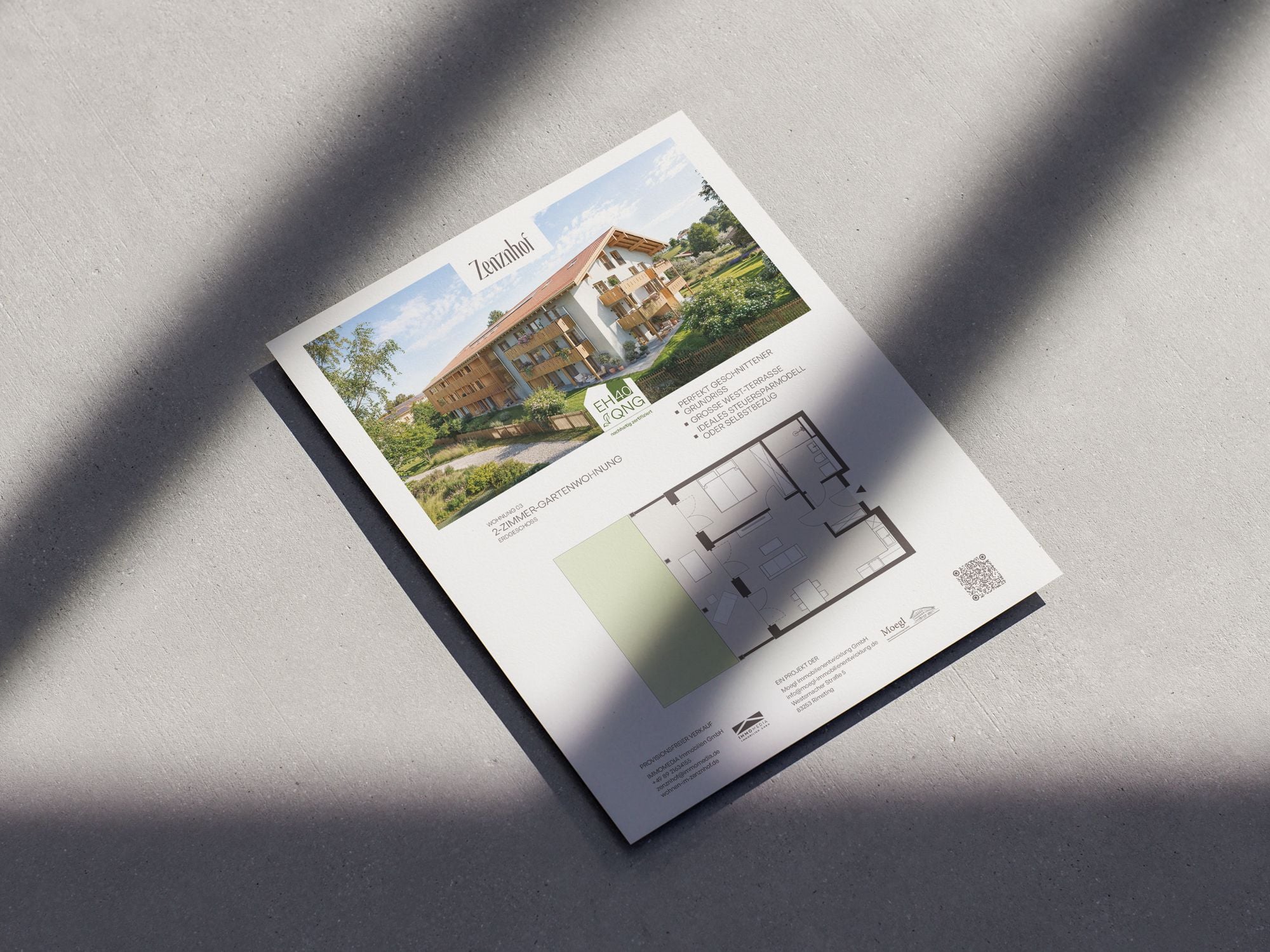
A floor plan needs space for the apartment number, area figures and a legible drawing. On the website, headlines sit alongside navigation, tables and contact fields. A site sign is read from a different distance than a brochure.
The Zenznhof floor plan illustrates that connection. The project name, architectural image, apartment data and drawing share one sheet. The identity becomes part of a document people use to assess a particular home.
For Davert Hof, we created the identity, visualizations, brochure and website. Those connected applications show how a project can carry a consistent presentation across different media.
Provide usable foundations for the next task
An organized handover helps everyone apply the identity consistently. Depending on the agreed scope, it can include:
- Logo variants and file formats for print and web.
- Defined colors and guidance on combining them.
- Typography and an agreed approach to font use.
- Guidance on imagery, spacing and key applications.
- Examples that can guide additional materials.
The value becomes apparent with the next task. A new floor plan, an additional website view or an updated brochure should fit the established identity. That requires design decisions people can understand and apply.
Match the scope to the development
A complete identity makes sense when the direction, name and design are still open. With an established identity, the work may focus on applying it to new materials. Sometimes a defined part is missing, such as a color palette or typography.
At Oblik3D, you can commission project branding or individual elements on their own, or combine them with visualizations, a brochure and website. We first establish which foundations are in place and which decisions remain.
Discuss your development with us. We will define a suitable scope for the identity and its applications.


